This Neo-Classic Palace Stopped Me Cold — 15 Exterior Secrets You Can Steal Today
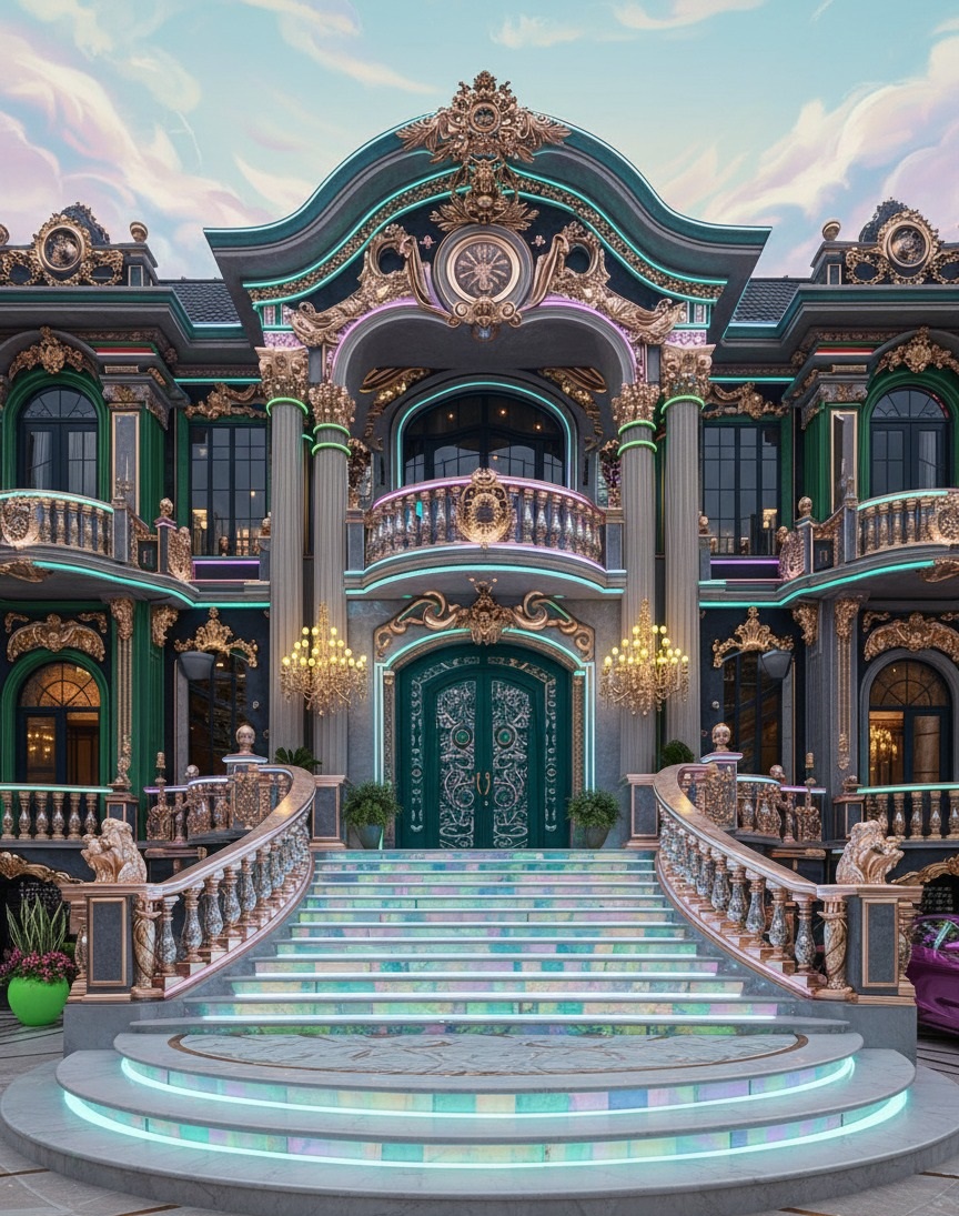
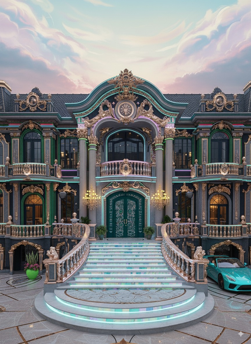
I still remember the first second I saw this façade: my breath shortened the way it does when an airplane lifts and your stomach lags behind. The lighting skimmed across carved scrolls like sunrise over a calm sea. Columns stood as if they had a heartbeat. And those doors—deep emerald with filigreed ironwork—felt less like an entry and more like a promise. Architecture can do that. It can meet you in the driveway and whisper, you’ve arrived.
You don’t need a mansion to borrow that feeling. The secret of show-stopping exteriors isn’t just square meters or budget; it’s rhythm, contrast, proportion, light, and a few carefully chosen materials that talk to each other. In this guide I’ll walk you—step by iridescent step—through the design moves that make this palace read as unforgettable, then translate each move into ideas you can adapt to a real-world home, villa, or renovation.
What Style Is This, Really?
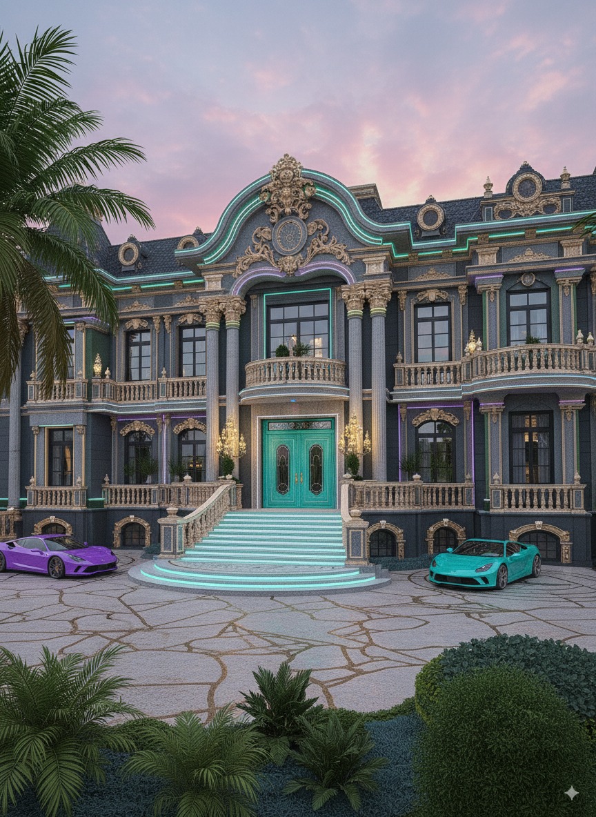
The façade dances between neo-classic, Baroque revival, and a dose of modern glamour. You see classical bones—columns, pediments, symmetry—wrapped in voluptuous ornament. But the story is updated using crisp LED edging, iridescent stair risers, and a jewel-tone palette (emerald, amethyst, and teal) that reads contemporary. In a sentence: historic silhouette, modern sparkle. That tension is why it feels both familiar and thrilling.
15 Exterior Secrets Worth Borrowing
- Grand sequence, not just a grand door. The curved staircases create a journey. Even a modest home can stage a “mini-sequence”: a low platform step, a planter, and a warm downlight guiding the eye.
- Color as jewelry. Jewel tones (emerald, teal, amethyst) punctuate deep charcoal walls. On a smaller house, limit saturated color to the front door or shutters for the same energy without overwhelming.
- Ornament with restraint. This palace goes maximal, but notice the zones: heaviest carving at the center, simpler sides. Apply the rule of three—one hero area, two supportive accents.
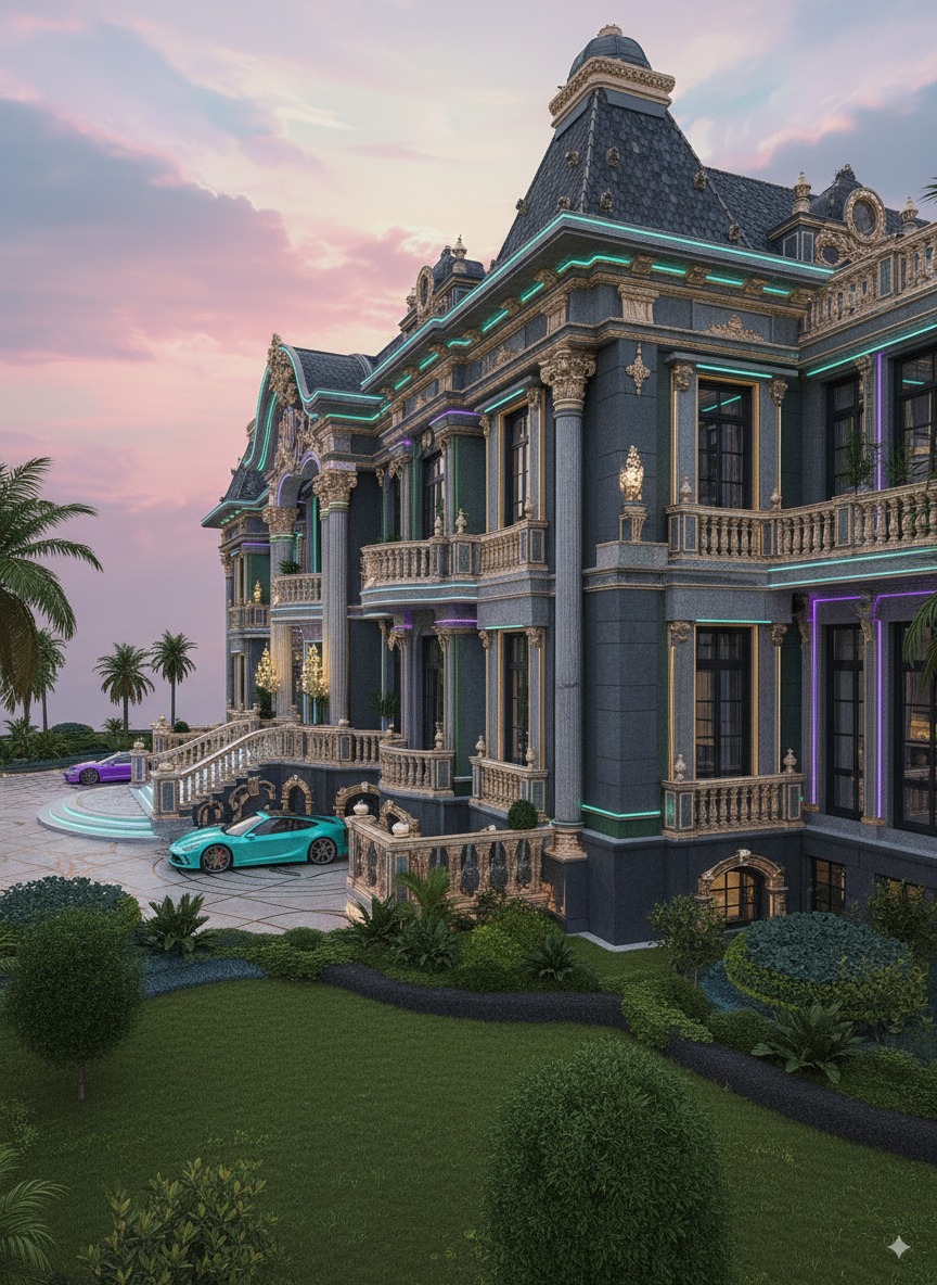
- Human-scale touches. Balustrades, urns, and lanterns keep the massive façade relatable. On a townhouse, use hand-height details (house numbers, knobs, planters) to ground the experience.
- Light skims, it doesn’t blast. The glow comes from concealed strips that graze textures. Swap bright floods for warm 2700–3000K grazers under cornices and steps.
- Contrast carries from day to night. Dark field + light trim by day; inverse glow at night. Choose a dark body color with high-LRV trim so LED edges read crisply after sunset.
- Repetition builds rhythm. Columns, windows, and pilasters repeat at a steady beat, which calms the eye. Echo one dimension—like 90cm window spacing—across porch posts, lights, and planters.
- Curves invite. The sweeping stair treads and arched openings soften all the straight lines. Try a radius step, arched trellis, or curved handrail to add welcome.
- Material pairing: matte + mirror. Rough stone beside glossy metal makes each read richer. A satin door next to honed stone achieves that luxe depth affordably.
- Door drama. Double doors with ornamental ironwork say “center stage.” For a budget take, install a single solid door with a shaped grille or carved center panel.
- Center, then step down. The middle bay is tallest and most ornate, stepping down at the wings. Use a gable, canopy, or taller trim only at the entry and keep sides simpler.
- Edge lighting = contouring. Thin LED lines work like makeup contour—defining profiles and cornices. Use weather-rated strips tucked into a small return so the source disappears.
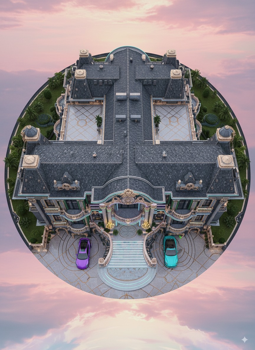
- Arrival court storytelling. The circular paving pattern quietly says “ceremony.” Recreate with a contrasting border band or medallion at the landing.
- Green is the luxury color. Trim shrubs and symmetrical pots tell the brain “well-kept = high value.” Even two identical planters by the door change the whole mood.
- Craft shadows, not just shapes. Deep moldings and urns are less about the objects and more about the shadows they throw. When in doubt, choose profiles that project at least 30–40mm to catch light.
How to Translate the Look to a Normal Home
Start with proportion. If the palace is a symphony, your home can be a chamber piece—same melody, fewer instruments. Keep your entry centered and taller than flanking elements. If symmetry is impossible, create “weighted balance”: a strong door on the left and a tall, slim cypress or lantern on the right to counterpose.
Next, pick one hero move. Maybe it’s an emerald door, a curved single step, or an LED cornice that traces your porch. One hero + two supporting accents (planters, house numbers) will read sophisticated and intentional.
Materials should feel honest. Use fiber-cement moldings where stone isn’t feasible; mix honed pavers with brushed metal; choose durable paints with UV inhibitors. When you limit the palette to two neutrals + one jewel tone, the result feels expensive even on a sane budget.
Materials & Finishes That Do the Heavy Lifting
Stone or stone-look cladding: Choose mid-to-dark charcoal for depth; lighter trims will pop against it. Gilded highlights: You don’t need real gold—architectural metallic paints or PVD-coated metals provide longevity and sheen. Ironwork: Laser-cut motifs can echo classic scrolls at a fraction of bespoke cost. Glazing: Black or bronze window frames pair well with jewel-tone accents.
Stair risers & paving: The iridescent effect can be recreated with glass mosaic bands or back-lit onyx look panels. Lighting: IP65 LED strips (2700–3000K) with aluminum channels; wall washers at columns; small pin spots to crown statues or urns. Hardware: Overscale pulls (30–40cm) are the “necklace” of your entry—choose them last to harmonize everything else.
Lighting: Why This Façade Glows (Not Glares)
Light is the invisible architect. Instead of blasting surfaces, the scheme here lets light skim across details so the eye discovers depth. Concealed strips under cornices act like eyeliner; step lights create a runway; chandeliers add sparkle without stealing the show. For homes, layer three types: grazers to outline, accent pins to punctuate, and a warm center glow at the door. Keep temperatures consistent (ideally 2700–3000K) so nothing looks harsh.
Landscaping & Arrival: Framing the Moment
Landscaping is the picture frame. This project uses clipped shrubs, disciplined palms, and planters that mirror the door color. Translate that by repeating two plant shapes (sphere + column), choosing a restrained palette (deep green + silver), and keeping soil lines crisp. The driveway pattern quietly guides cars and feet; on smaller lots, a contrasting border tile or a round doormat in stone achieves the same sense of “stage.”
Common Mistakes to Avoid
- Too many colors. Pick two neutrals and one jewel tone, then stop.
- Harsh light temperatures. Keep exterior lighting warm—cool white makes stone look chalky.
- Underscaled details. Tiny lanterns or skinny trim will disappear. Go one size larger than you think.
- Flat façades. Add depth: a projecting sill, a cornice, or a curved handrail will throw beautiful shadows.
FAQs
Is a jewel-tone door too bold for resale?
Not when balanced by neutral walls and thoughtful lighting. Doors are easy to repaint; the perceived “luxury upgrade” often increases curb appeal in listing photos.
How do I create the iridescent stair look affordably?
Back-lit glass mosaic bands or LED strips tucked behind a frosted acrylic riser give a similar shimmer for a fraction of the cost of natural stone panels.
Do I need symmetry?
True symmetry helps, but you can fake it: align the door with a centered light, then use a tall planter on the opposite side to balance a window or garage line.
What maintenance should I plan for?
Annual sealing for stone or stone-look cladding, gentle wash of LED lenses, and touch-up of metallic paints every 3–5 years depending on climate.
What’s the single best upgrade if I can only do one?
A dramatic door with oversized hardware (30–40cm pulls) and a warm halo light. It broadcasts quality day and night and changes the experience immediately.
Final Thoughts
Great exteriors aren’t about excess; they’re about emotion. This palace succeeds because it choreographs your arrival—curve by curve, light by light—until you feel part of something larger. Borrow the sequence, compress the scale, and let your home offer that small theater of wonder each time you turn the key.